WaveMakers
WaveMakers is a forecast app that provides surfers with the weather information and safety recommendations necessary to make informed decisions before heading to the water. This project was conducted as part of my UX Design Program (“UX Immersion” course) with CareerFoundry. I designed the app with marginalized communities and first-time surfers in mind so they can feel supported as they venture into the surf world.
My role:
UX Design
UI Design
UX Research
Branding
Prototyping
User Testing
Tools:
Adobe XD
Adobe Photoshop
Adobe Illustrator
Zoom
Canva
Flaticon
Timeline:
9 months, part-time
(up to 20 hours/week)


Discovery 🔍
The Problem
Some of the common reasons people surf are to challenge themselves, connect with nature, and be part of a passionate and exciting community. To make sure that they can do this safely, it’s common for surfers to check the conditions of the wind, waves, and weather near where they will be catching waves. Knowing this information can help surfers avoid dangerous situations and better prepare for their time on the water. However, this can be difficult for surfers, especially beginners, since many existing forecast apps display complex weather data in a difficult-to-understand way.
Surfers need an app that shares weather conditions for a given area in a simple and aesthetic way because they want to know what the waves are like and whether the water is safe to surf in. We will know this to be true when we see how many surfers use the app to check the weather before they go into the water.
Competitive Analyses
To gain inspiration for what I should and should not include in my app, I conducted competitive analyses on two of the most popular surf forecasting apps: Surfline and Magicseaweed.
The analyses showed that surfers enjoy using Surfline and Magicseaweed because they both empower users to be their own forecasting experts through the use of live cameras and human reporters. The global reach of the apps and the detailed graphs/maps provide users with comprehensive knowledge of the current weather conditions. Additionally, both apps foster a community by having a large social media following that highlights professional surfers performing at their best on the water.
However, there were a few aspects of both apps that caused frustration amongst users or could be improved.
Based on this research I made initial plans for how I could design the new app.

Understanding the User
After weeks of being unable to find surfers who were willing to participate in user interviews, my mentor suggested that I contact people who were not currently surfers to ask them why they had not participated in the sport, and if/why they were hesitant to do so. This idea intrigued me since many of the existing resources I researched were targeted at experienced surfers, so I was unsure if beginners or anyone who had a basic interest in surfing were having their needs met.
I interviewed three people who had little to no surf experience. I asked about their reasons for not surfing, and if they thought anything could encourage them to pursue the sport. All of the participants identified as women, people of color, and/or members of the LGBTQ+ community.
With the insights I gain during the user interviews, I created my primary persona.
“I’d want to know whether it’s safe to surf, and then what the details are that support that consensus.”
“It’d be cool if I could input my surfing level, and then the app tells me if it’s a good time to surf.”
“I’d want the app to have a neutral vibe rather than the typical surf persona I don’t identify with.”
Persona
After conducting the user interviews I decided that my target audience would be people in marginalized communities that were interested in surfing, but were not yet completely comfortable due to safety concerns and/or feeling excluded by the “surfer bro” stereotype. Because I needed a specific user in mind throughout my design process,
I created my primary persona, Fatima Smith.
Fatima is a busy and technology-advanced millennial who lives in Seattle, WA. She is considering surfing as a way to de-stress and gain more work-life balance, but she is also worried that she will not know how to stay safe in the water. Fatima needs a way to learn about the basics and what to expect on the days that she surfs to feel more confident and well-prepared.

Scenario
I storyboarded a scenario for Fatima to better understand the frustrations they would have with current surfing resources.

Defining Goals
Project Requirements
In addition to the basic features that are required for mobile apps, my UX Design program also had a list of requirements specific for the surf app project.
The features that I needed to include are:
A display of wind conditions in real-time
A display of wave conditions in real-time
A display of weather conditions in real-time
A display of algae reports in real-time
Recommendations that can help users stay safe
User Goals
Learn how to stay safe when surfing.
Personalize their surfing journey to opt in and out of features.
Not feel like an outsider in a predominately male and white sport.
Potential Difficulties
The primary risk is that the app will not be able to provide accurate information in real-time.
Because it will be a new app, it may not have enough global employees who can update the weather forecasts and reports several times each day.
Another risk could be the large number of surfers who are loyal to other apps, especially Surfline, and may be reluctant to explore other platforms.
Possible Solutions
There is a hole in the market for an app that provides beginning surfers with information on weather conditions.
The key is to create a user experience that presents weather information in an aesthetically pleasing way that is also easy to understand.
The backend development of the product will have to be optimized so that the information is accurate at any given time.
Marketing will be important to present the app as an appealing alternative to popular competitive platforms.

Ideation 💡
User Flow
I created a user flow that shows how my primary persona would achieve their main goal of reading safety recommendations.

Site Map
After reviewing the project requirements and user needs, I created a site map to organize the navigation of the mobile app. I collaborated with fellow UX design students to refine the site map so that it had a more instinctive layout.

At this stage, I chose the term “surf spot” to describe a specific body of water that users surf at because during my additional research some people thought words like “destination” and “location” were too ambiguous.
Design 💻
Wireframes
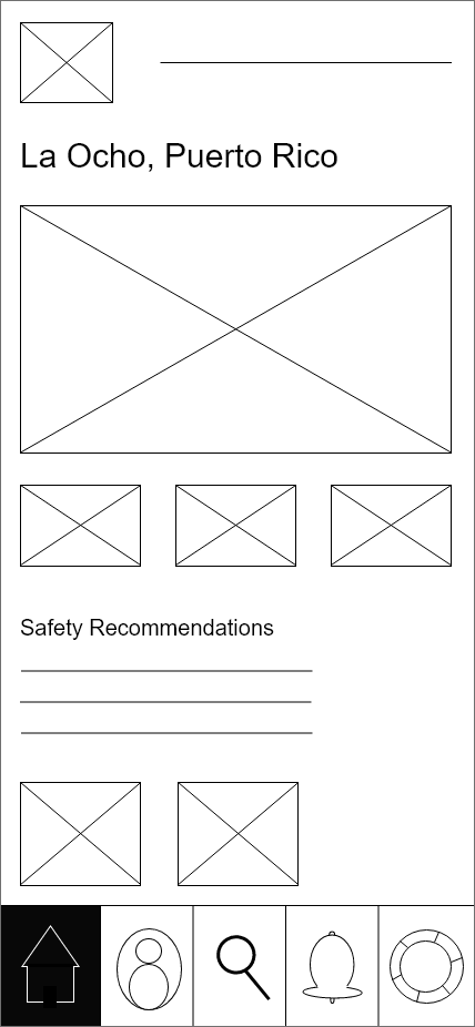
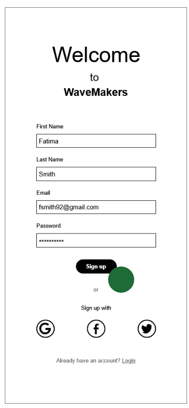
The site map provided a starting point for me to create low-fidelity wireframes of the login/sign-up page, homepage, surf spot page, and profile page. As I designed these pages I prioritized the objective of this project: create an app that had beautiful displays and easy navigation.
Using Adobe XD, I created mid-fidelity wireframes that were clearer and more refined. These wireframes helped me gain a better idea of the visual design of each page.
To prepare for user testing sessions, I created high-fidelity wireframes that provided more content for participants.
In addition to receiving general feedback and insights about the design of the app, I also conducted testing sessions to determine how easily participants were able to complete the following scenarios:
Scenario #1: Searching for Wind Conditions
You are a beginning surfer currently living in Puerto Rico and you’re interested in surfing at La Ocho since it is a nice day outside. Before heading to the beach you check the WaveMakers app to see what the wind conditions are at that surf spot and if they’re suitable to your level.
Scenario #2: Switching to Safety Recommendations
Because you know that surf spots may have various safety hazards, you want to make sure that you follow the safety precautions at La Ocho. You find and read the surf spot’s safety recommendations to stay well-informed.
User Testing & Solutions
For this round of user testing, I recruited six participants who all identified as female from various ethnic/racial backgrounds and had no surf experience. Each session was 1:1, one session was in-person, and the other five were held virtually through Zoom.
After the testing sessions, I made design changes to the app to better align with Material Design Documentation. I also made a Rainbow Sheet to better analyze participants’ responses to prioritize which other changes I should make.
Some of the participants’ responses that led to major changes include:
Surf Spot
“This drop-down menu was a bit unclear on what capabilities I’d be seeing.”
Before


Half of the participants were unsure how to navigate to the safety recommendations.
After


I changed the menu from drop-down to accordion so that the users can immediately see what content is available.
Homepage/My Saved Surf Spots
“When I clicked on La Ocho on the homepage, I assumed it was going to direct me to that surf spot’s page. If it has that location listed on the homepage, I wouldn’t want to see another page full of saved surf spots, I would just want to go directly to the surf spot’s page. Otherwise, I’d want to see ‘My Saved Surf Spots’ as like a button on the homepage.”
Before


The participant did not think that the suggested article was necessary for users only interested in weather forecasts.
This preview of the user’s saved surf spots confused a participant.
After


I deleted the original homepage so now users are directed to the “My Saved Surf Spots” page.
I edited the navigation bar so that users can view articles and other media on a separate page.
Branding
I decided to use various shades of blue throughout the app as primary colors to evoke calmness and peace. My goal is to evoke a feeling of serenity since beginners may be hesitant or even scared of surfing. Also, blue is also on theme with the ocean water.


Delivery 🎁
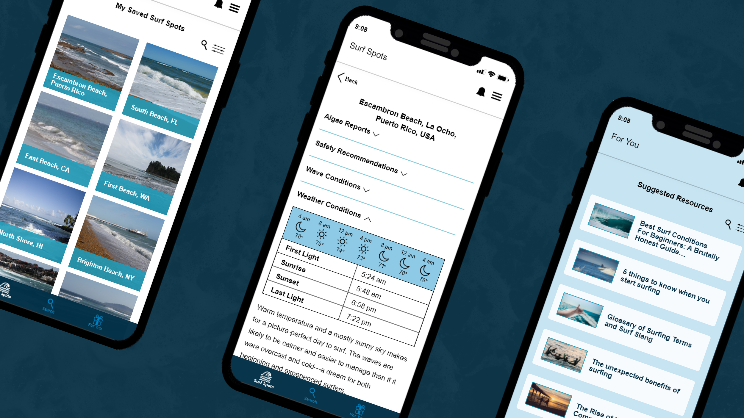

Find Places for Surfing
Save your favorite/frequently visited surf spots to your account for easy access. Use the search feature and filter to find new surf spots that met your criteria.

Educate Yourself
Read up on the provided information to prepare yourself for a day on the water.

Shape the App to Fit Your Needs
Pick your surf experience level so that the app can provide better safety recommendations and article suggestions.

Learn about the World of Surfing
Browse through the resources that are specifically suggested to you so that you can learn about the sport and community at your own pace.

Reflection 🤔
Here are the top lessons that I learned throughout the process:
Think outside the box
During the Discovery phase, I was initially stumped on how to start the design process because so many existing forecast apps already had many loyal users and an extensive range of beaches covered. With the guidance of my mentor, I was able to take a different design angle that led to a product targeted at a previously neglected group of users.
Ask “How” and “Why”
While I was figuring out the design hierarchy and navigation process, I had to continually ask myself how users of different surf experience levels would interact with the app, and why they would start using it in the first place. Although I was focusing on my primary persona, I knew that the app had to be intuitive and flexible enough so that various users would be able to achieve their goals. For this reason, I made design decisions that centered around customization based on the user’s needs and preferences.

Next Steps 📝
More testing sessions, and more iterations to improve the design.
Collaborating with members of the surf community so that surfers with more experience can also use the app.


