AstroLudo
AstroLudo is a native app for astrophysicists who want to play lighthearted games (based on Taboo, Pictionary, and Charades) without feeling guilty for not focusing on topics in their field. I was the sole designer on this project and owned the end-to-end process while collaborating with the founders and a developer. This was the first phase of a project.
Due to the company undergoing several internal changes before public launch, I have changed proprietary information including branding, subject areas, and the primary user.
My role:
UX Design
UI Design
UX Research
UX Writing
Content Design
Branding
Prototyping
User Testing
Animation
Tools:
Figma
Adobe Illustrator
ChatGPT by OpenAI
Miro
Notion
Zoom
Google Slides
Timeline:
4 months, part-time
(up to 20 hours/week)


Discovery 🔍
Is It Possible to Make School Stuff Fun?
A team of 10 astrophysicists decided to create a game designed specifically for other members of their field. The idea for this game originated while they were working on their PhDs in astrophysics, and they realized that weekly game nights were an enjoyable way for them to spend time with each other and de-stress from their intense studies. However, many of them were also conflicted because they felt guilty for having fun during their free time when they still had so much work to complete for their dissertations. This conundrum led some of those individuals to wonder:
“Is it possible for us to have fun playing games without feeling guilty for not constantly thinking about astrophysics?”
Thus, AstroLudo was born.
Following several months of forming the company and creating the foundation for the games, the AstroLudo founders contacted me to design the first iteration of the mobile app so that they could meet their public launch deadline (their first designer had unexpectedly left the project so the team was already more than one month behind schedule by the time I was onboarded).
Gaining an Understanding of the User
After my first meeting with the founders, I used ChatGPT by OpenAI to research astrophysics and gain an initial idea of how complex the topics of the games was going to be.
Later, I created a user survey to gain more insights into the behaviors, preferences, and pain points of astrophysicists when they interacted with digital products. I created an affinity map to compile the data that were gained from this research.
Here are some of the key insights:
Behaviors: When I Use Apps
“At night”
“Throughout the day”
“Whenever I have time”
User Needs/Goals
“Simplicity”
“Can do from anywhere”
“Simple user interface so that I can focus on content presented”
Frustrations
“More user friendly”
“Better readability and ability to customize”
“More consistent use of the app”
Keeping the Average User in Mind
Using the insights gathered from the user survey, I created a primary persona to reference so that I would keep the user’s goals and pain points in mind throughout the design process. Additionally, I presented the persona to the founders of AstroLudo to remind them that although they would become users of the app after its public launch, the design had to be based on user research with a wide range of participants rather than what simply meets their individual preferences.

Compiling Goals and Pain Points to Find a Solution
User Goals
As a user, I want a simple user interface so that I can focus on content.
As a user, I want a product that I can use from anywhere.
Client Goals
Create a fun game for people in the astrophysics world to play to de-stress and spend time together.
Include the foundation for features to possibly be added at a later time.
Potential Difficulties
Making the app inviting so that users will not become intimidated by its content.
Finding enough users for the app since the demographic is very niche.
Possible Solutions
Have a simple process for choosing the game topics so that users do not have to spend a long time selecting granular areas.
Ensure that the colors and text used throughout the app emphasize that it is a game with low stakes and that the goal is to have an enjoyable experience with peers (rather than winning).

Ideation 💡
Figuring Out the Navigation
I created a user flow that shows how Gabby would accomplish the two main tasks that were provided to me from the founders: playing the games, and creating more cards that could be added to the game.

After further discussion, the process of creating and adding more cards was omitted from this phase and added to the list of goals for future phases. The reason for this decision was that the founders were still deciding how they wanted to market the app, and because the deadline for public launch was approaching, they wanted to continue with the simpler version of the app.
Building the Information Architecture
Using the insights from the user survey, I created a site map to organize the navigation of the mobile app.

Although it was proposed during the first meeting, the “My Favorite Games” feature was ultimately not included in this version of AstroLudo since there are only three types of games available and the others would not be finalized before the launch.
Design 💻
Sketching Ideas Based on Familiar Apps
At the beginning of the design phase, I asked the founders to provide me with screenshots of the digital study tools that they and their peers most often used in their field. While AstroLudo is not a study tool, I knew that a game this specific would mean that the primary user demographic would be familiar with the same few apps and websites, meaning that I could take inspiration from those products to create an experience that felt intuitive and inviting.
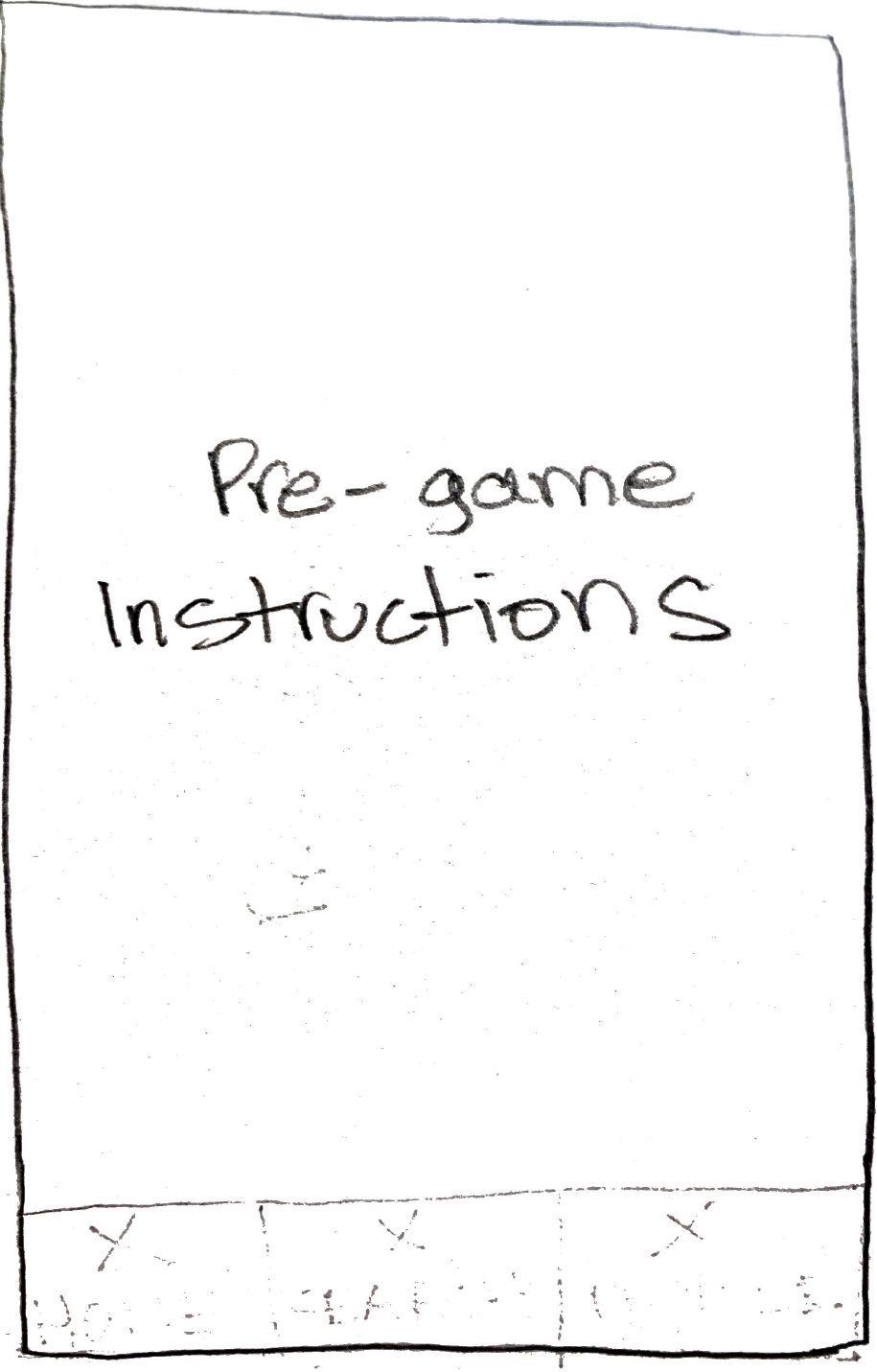
During my presentation of the low-fidelity wireframes, the founders immediately recognized the menu and layout of the app, and enjoyed how easy-to-use the navigation was.
At this time, we decided to remove the bottom navigation bar because the founders noted that they did not have enough content that would warrant that many buttons, and I felt that having a side and bottom menu may be confusing to users who are expecting a simple gaming experience.
Conducting Usability Testing of Prototype
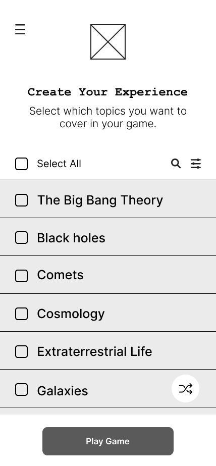
Using Figma, I created mid-fidelity wireframes that were clearer and more refined. These wireframes provided the founders with a better idea of the visual design of each page.
I later used these wireframes to create a mid-fidelity prototype for the first round of user testing.
In addition to receiving general feedback and insights about the design of the app, I also conducted five testing sessions to determine how easily participants were able to complete the following scenarios:
Scenario #1: Playing a Full Round
You are an existing user who signs back into your AstroLudo account to start playing a game. You continue playing until the game is over and you receive a final score.
Scenario #2: Getting Onboarded
You are a new user who just saw your friend play AstroLudo. You want to create your own account and you start the onboarding process to become familiar with the app yourself.
Using Feedback to Improve the UX
Listening to the recordings from the user testing sessions, I created a Rainbow Sheet to analyze the results and prioritize changes based on how often errors were made and the seriousness of the comments by participants.
Two of the main changes that I made to the design based on the data were:
Choosing the Game
“I think it’d be cool to [choose the game type.] ‘Cause you’ve got multiple game types, but somebody might want to do just one. [...] You should have the opportunity to do so that way you stick to a theme and keeping it singular.”
Before


40% of testing participants noted that they would prefer to have the option of selecting which types of games they could play.
After


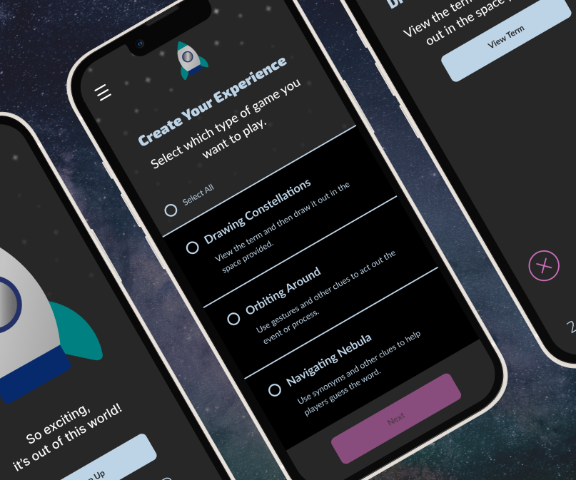
Having a two-step process allows users to select what type of game they want to play and which topics to focus on. Also, it may make it obvious that it’s a game (rather than a serious study tool).
Loading the Game
“You’re like ok I’m ready to play and then it starts. It’s a little bit like ‘Oh f*ck.’”
Before
Almost half of testing participants said that the automatic countdown made them feel anxious and made the app feel less like a fun game.

After
Because another participant mentioned having the logo do a fun dance would make them feel like they had a friend, I suggested switching to an animation before the game started to make the atmosphere exciting and friendly.
Bringing the Prototype to Life with Colors, Fonts, and Animation
Before I created the high-fidelity wireframes and prototype, I asked one of the founders to describe the adjectives that they hoped the users would use to describe the app. They responded with “excited,” “light,” “fun,” “interactive,” “funny,” “laughter,” and “high energy." I kept these words in mind throughout the second part of the design process in which I focused on the user interface and content.
Color Palette & Typography
To help me brainstorm ideas, I used ChatGPT to find popular colors and typography for space-theme games. For the colors, I used color theory and focused on ChatGPT’s results that would be likely to induce target emotions given by the user research. I also used WCAG 2.0 to ensure that AstroLudo would be accessible to users with visual impairments.


When deciding on the font sizes and styles, I referenced Google’s Material 3 to guarantee that AstroLudo included best practices for iOS.

Content
Although I did not create all of the content for the app (the founders provided the list of topics and terms for the games), I did write the slogans, microcopy for the buttons, the instructions, and the onboarding messages. To make sure that the copy for each area was consistent and matched the user and client goals, I used the founder’s response (e.g. “excited,” “light,” “fun,” “interactive,” “funny,” “laughter,” and “high energy”) as voice principles throughout the content design process.
Logo and Animation
I designed the logo with soft edges and a simple look to make it reminiscent of a cartoon. The goal of this design was to make the app even more friendly and evoke a sense of child-like enthusiasm for playing a space game.
While the animation is fairly straightforward, I designed and included it to add more vibrancy and life to AstroLudo. It also addresses one of the participant’s wishes for a friend to have within the app itself.


Delivery 🎁


Designing a High-fidelity Prototype
Have more autonomy by choosing the gaming experience that fits your current mood and interests.

Enjoy playing familiar games within the two-minute round.

Take a look at how well you did as a team.

Sharing Presentations with the Client
Throughout the entire project, I hosted regular Zoom meetings with the founders to share my updates, concerns, and next steps. When I was not sharing my screen to present my work in Figma, I created and shared a presentation in Google Slides so that the founders had a visual reference throughout the meeting that was not too tech-savvy or overwhelming.
Below is a screenshot of a slide from the user testing results presentation.

Writing a Content Style Guide for Future Phases
Within the style guide, I specified the jargon that should (and should not) be used throughout the app:
“The text should be friendly, simple, and straightforward. Users should feel like they are being welcomed to join a fun, light-hearted experience. Stay away from language that can be viewed as judgemental or induce stress such as ‘correct,’ ‘incorrect,’ ‘right,’ ‘wrong,’ ‘results,’ ‘test,’ ‘study,’ ‘review,’ etc.”
Ensuring a Smooth Handoff Process for Developer
To make sure that the developer had all the materials necessary to start the implementation phase, I created a zipped file with the style guide, screenshots, link to the prototype, and all assets as SVGs.
Reflection 🤔
Here is the main takeaway that I gained from this project:
Remind Clients that They Are Not Always the User
As I mentioned briefly, I quickly realized during the Discovery phase that many of the founders had envisioned AstroLudo with themselves as the primary users. While this was somewhat true and proved helpful when I had questions about the emotions that they hoped the app would evoke, it also meant that there were moments when the clients wanted to shape the app according to their specific preferences (e.g. color palette, visual hierarchy, the layout of the menu, etc.), or they did not understand the need to make time for user research. While their concerns about the timeline and the desire to include numerous design features were warranted, I repeatedly emphasized that human bias is inevitable and because they had been creating this product for more than a year, they were very familiar with how it worked, but the average user would not have the full background context. Additionally, to help the team better understand my reasoning behind design decisions, I shared UX design principles so that they would feel more included in the process and have more knowledge of how we could make AstroLudo user-friendly and intuitive.

Next Steps 📝
Test the high-fidelity prototype to gain insights about branding and animation.
Add copy for error messages to inform users of input that needs to be corrected.
Work with the founders to create long-form content such as “Rules.”


