Lalich Center: Phase 2
The Lalich Center team wants to create a website to grow an online presence that complements the organization’s non-profit status. To help accomplish this goal, they partnered with Tech Fleet, a DAO that offers apprenticeships to new tech talent looking to gain experience working with real clients on Agile teams. Each Tech Fleet apprenticeship is approximately eight weeks long and on a part-time basis of 15-20 hours/week. Throughout this project, I worked on the UX writing/content design team as a team lead to define the writing style and content strategy, collaborate with the client to refine the branding voice, and guide apprentices through the ideation, writing, and delivery processes. This was the second phase of an ongoing project.
My role:
UX Writing/Content Design Lead
UX Research Team Ambassadorship
Tools:
Figma
Notion
Zoom
Timeline:
3 months, part-time
(20 hours/week)

Discovery 🔍
Starting with the MVP and Launching a Live Website
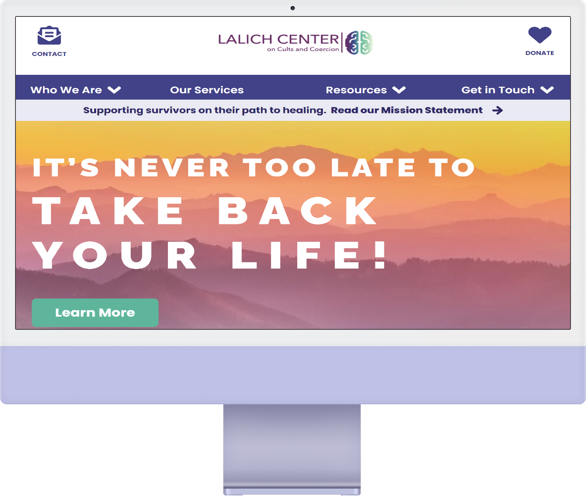
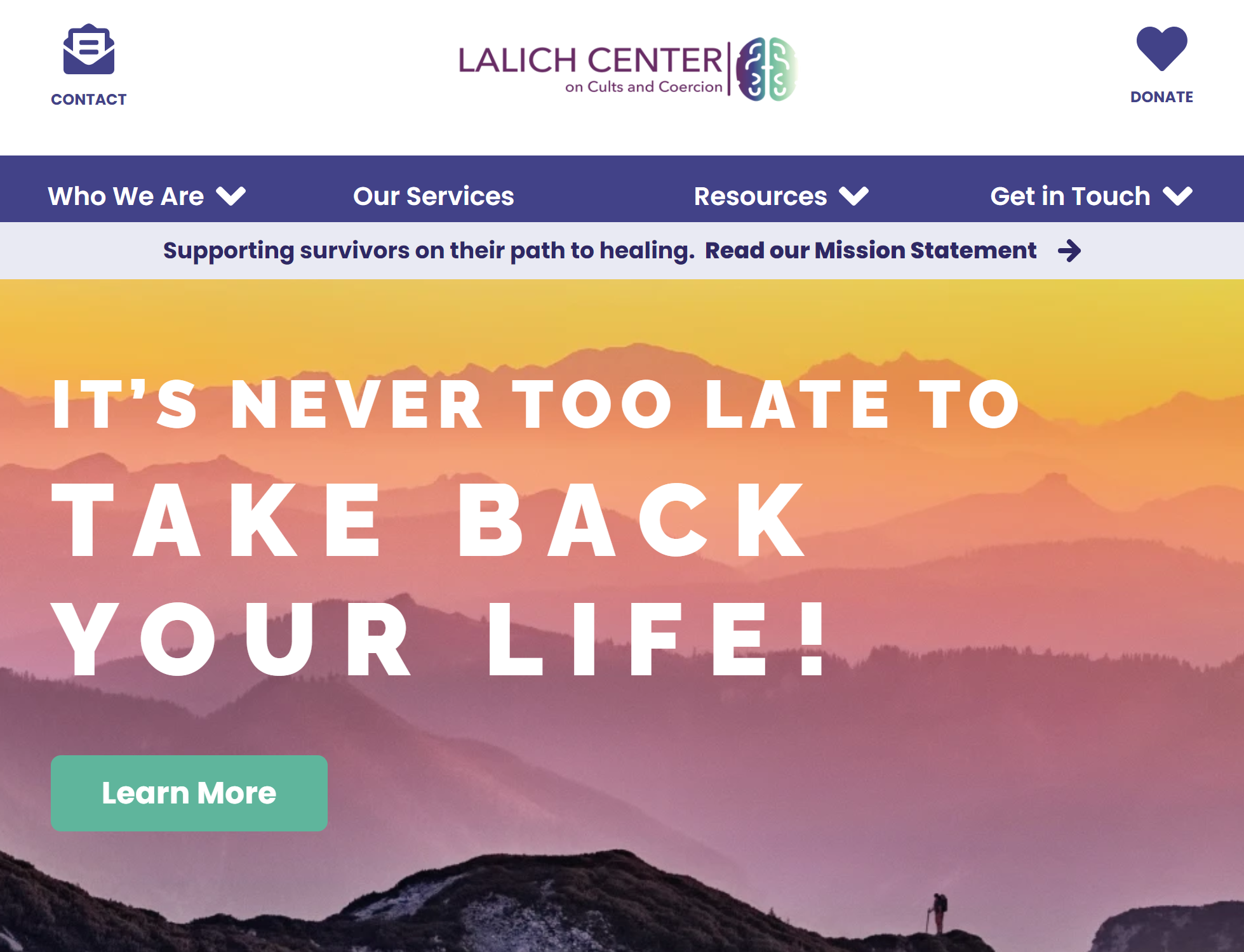
The Lalich Center supports survivors of cults and coercive relationships to live meaningful lives by providing educational resources. They also offer assistance to mental health professionals and family/friends of cult members. They are led by Dr. Janja Lalich, an internationally-known cult specialist, and survivor. They had a placeholder website that was not branded or aligned with the team’s vision for the Lalich Center. They are hoping that a design team will create a website that conveys the organization’s mission, feel, expertise, and safety so that users can feel confident and secure in seeking and utilizing resources.
This project was the second phase of the client’s website design process. In the first phase, (during which I was a product strategist/owner), the Tech Fleet team created a high-fidelity prototype of the website, a high-resolution logo, and a style guide for future UX writing/content design and UX design teams.
For the second phase, the client’s main goal was to have a live website that could inform the user about the organization, encourage the user to donate, and allow the user to sign up for discussion groups hosted by the Lalich Center.
Due to this goal, the team was expanded from the previous phase, and in total included:
Product Strategy/Ownership
Project Management
UX Research
UX Design
UX Writing/Content Design
Website Developers
Re-establishing Goals and Possible Limitations
Client Goals
The Lalich Center team has the following requirements for their website:
Homepage
Sign-up page with Intake Questionnaire Form
Course Description page
Discussion Groups page
Donation page
Password-protected Registration and Payments page
About Us page
Privacy Policy page
Resources page
Media page with links to podcasts, books, and documentaries
Project Goals
The goals for this project for the Tech Fleet team were:
Work with the client to define MVP and MMP scope
Continue defining the MVP with the client
Conduct exploratory and evaluative UX research throughout the entire project
Further exploration of user needs, behaviors, and problems to solve with the Lalich Center website
Validation of the site map and information architecture
Validation of designs with usability testing
Create Interaction designs for flows per the client’s needs
Continue iterating on the UX writing/content strategy for the website
Create high-fidelity, pixel-perfect design sets representing the client’s needs
Develop the Lalich Center website with a no-code tool
Design a secure digital infrastructure that safeguards the Lalich Center
Potential Difficulties
Finding an effective cross-team collaboration method, especially between the UX writing/content design, UX design, and website development teams.
Working part-time for eight weeks not being long enough to accomplish all client and project goals.
Aligning both the Tech Fleet and Lalich Center teams’ schedules to have meetings throughout the project.
Possible Solutions
Having cross-functional meetings often to learn about each team’s updates and how they will affect the decisions of other teams.
Contributing to the handoff document so that teams working on future phases have access to team notes and ideas about where to pick up from.
Work with the Lalich Center team on a regular asynchronous basis (i.e. not only during biweekly demos) to clarify the tone and voice of the organization.

Ideation 💡
Listing Voice Principles
For this phase, the UX writing/content design team determined the following voice principles: honesty, understanding, credibility, and safety.
These principles were provided to us as branding words by two of the Lalich Center board members during an initial client meeting. They were later used throughout the project by being at the forefront when conceptualizing individual webpages.
Utilizing 5-Minute Brainstorms
To start the flow of ideas, my co-lead and I included five-minute brainstorming sessions in our one-hour team meetings so that all the UX writers/content designers could quickly make progress on webpages and have a starting point for creating content.
After the brainstorming sessions, my co-lead and I gave the apprentices the opportunity to select which webpages they wanted to design content for asynchronously. As a leader on this project, I believed that apprentices should have the first pick of writing assignments so that they could feel more involved in the project and take more ownership.

Writing ✍🏽
Leading Writing Workshops
After creating content for webpages on their own time, the UX writing/content design team would present mockups and offer feedback during the following team meetings. As a lead, I emphasized the importance of constructive feedback by both complimenting the designer’s thought process and offering suggestions for how to make the script/visual hierarchy more intuitive and aligned with the brand voice.
Throughout these workshops, a democratic process was utilized by having each UX writer/content designer vote on design decisions, and then the ones with the most votes were selected for implementation.

Communicating Content Needs with Other Teams
Sharing Design Decisions with UX Designers
To make the handoff process simpler for the website development team, my co-lead and I worked directly with UX designers by sharing our final content and then collaborating with them as they incorporated it into their own designs. After the UX designers completed their mockups, they shared their files with the website development team.
This collaboration process was an opportunity for us to advocate for the role that UX writers/content designers have within a design project. We determined when certain design decisions fell under the jurisdiction of UX writing/content design, and defended our final content mockups by explaining that they were based on the client goals and brand, user needs based on first-phase user interviews, and technical limitations stated by the website development team.
Helping UX Researchers Plan Content Testing
For this project, I was the ambassador to the UX research team. I volunteered for this position so that I could attend the weekly UX research team meetings and immediately become aware of any roadblocks that the UX writing/content design team should know, and provide recent updates by the UX writing/content design team.
I also assisted UX researchers with planning the user testing sessions. Due to a restricted time frame, the UX research team decided to combine usability and content testing sessions into one. I worked closely with the lead UX researcher to write the testing script so that the full Tech Fleet team could understand user pain points and feedback, and also so the UX writers/content designers could receive data about how the users feel and respond to terminology, information architecture, and color palettes. This data was analyzed by UX researchers, and the UX writing/content design team added notes and recommendations to the handoff document to address the feedback in later phases.

Delivery 🎁

Adding Empathy to the Error 404 Message
The only webpage that I took complete ownership of was the Error 404 message. The reason for this was, as I stated earlier, I first gave each apprentice the opportunity to own webpages.
For this page, I created UX writing copy that matched the voice and tone of the Lalich Center.


The text is sympathetic to the user and the frustration that they may be feeling.
The title is informative and states what happened as opposed to being pessimistic (e.g. it does not state “Oops, we couldn’t find that page!”).
There are suggestions for other actions that the user can take. This contributes to the organization’s mission of supporting users to accomplish their goals.
Presenting Updates to Client
Every other week, the Tech Fleet team presented demos directly to the client. These meetings were an opportunity to update the client on progress, learn initial impressions based on body language and facial expressions, and ask questions to ensure that the process was aligned with the client’s vision for the website.
I presented several of the demo slides for the UX writing/content design team. I made sure to explain our thought process behind each design decision, how the design of each webpage addresses a specific user story, and future plans for testing if the webpage met the acceptance criteria determined in the first phase.


Creating a Style Guide for future Content Designers
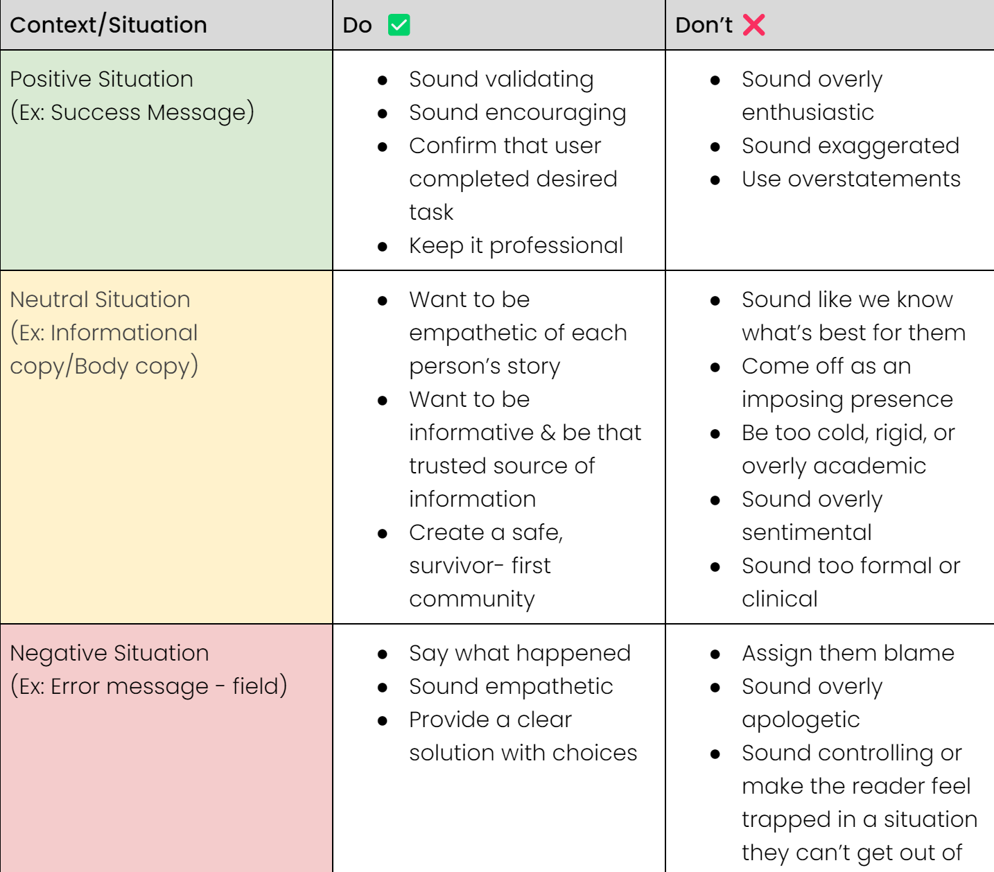
To help the full Tech Fleet team agree on writing conventions and terminology, the UX writing/content design team created a style guide. The goal was to prevent inconsistency or use of triggering language, and ensure a familiar voice and tone across all content for the Lalich Center. We believed that aiming for predictability would help users navigate their online experience and become recurring visitors to the website.
Rather than edit the guide created during the first phase, we decided to maintain a record of contributions by creating a second version of the Content Style Guide that included additional notes from the Lalich Center.
Ensuring a smooth Handoff Process for Phase 3
To ensure that UX writers/content designers of future phases have a clear starting point, we created a handoff document that included links to various files, notes on what worked well, pain points, and suggested next steps.
Reflection 🤔
My main takeaway from being part of the second phase of this project is:
Establish an Effective Method of Communication ASAP
During the last few weeks of the project, I learned that many of the Tech Fleet team members were communicating with the UX designers about concerns, questions, and revisions that should have been directed at the UX writing/content design team. The reason for this miscommunication was that many people were confused about who had jurisdiction over which tasks, and were unsure how to inform every team member about changes and updates.
Working more closely with the UX design team by combining UX design and UX writing/content design meetings would have been a solution. This way, the UX writers/content designers would have been informed about any new updates sooner and then ambassadors to the UX designers from other teams would have been able to ask questions about content to UX writing/content designers directly.
This is a reflection point that I shared with the project managers and product strategists/owners so that it can be addressed in future project phases.

Next Steps 📝
Add notes and recommendations to the handoff document so that future UX writers/content designers know which content still needs to be tested.
Make sure that all files and information are clearly organized and accessible for the Tech Fleet apprentices working on the third phase.
