Ecosense
Ecosense is a native mobile app that allows users to share updates of their local environment in the form of photos, videos, and text. Updates are sharable to other users living in the area and with officials in positions of power. This project was conducted as part of the environmental track of the BUILD ‘23 Hackathon. I worked on a team of four that included all UX/UI designers.
My role:
UX Research
UX Design
Tools:
Figma
Miro
Timeline:
One weekend
(up to 12 hours/day)


Discovery 🔍
The Problem
People in communities of color and poor communities are disproportionately more affected by environmental catastrophes. These communities are not only facing environmental injustice, but also hazardous health and environmental concerns. Examples of environmental concerns include coming in contact with heavy metals, toxic wastes, and air contaminants. Prolonged exposure can lead to health concerns including premature death and detrimental health conditions, like heart diseases, respiratory infections, cancer, and immune deficiencies.
To address these catastrophes, our team decided to answer the following problem statement:
How might we encourage residents to communicate real-time environmental updates to each other so everyone stays informed about situations and is less anxious?
Defining Goals
User Goals
As a user, I want to understand how environmental impacts affect my life.
As a user, I want to be informed of what is happening in my local community.
As a user, I want to have the opportunity to share my experience to officials who have the power to improve the local environment.
Potential Difficulties
The primary risk is that the users will not see the impact of their efforts and then will stop using Ecosense.
Possible Solutions
Share actions that officials have taken due to user impacts to encourage continued usage of Ecosense.

Ideation 💡
User Flow
As a team we created a preliminary user flow chart to demonstrate how users will complete the main tasks of sharing photos and/or video to notify other residents and officials.

Design 💻
Wireframes
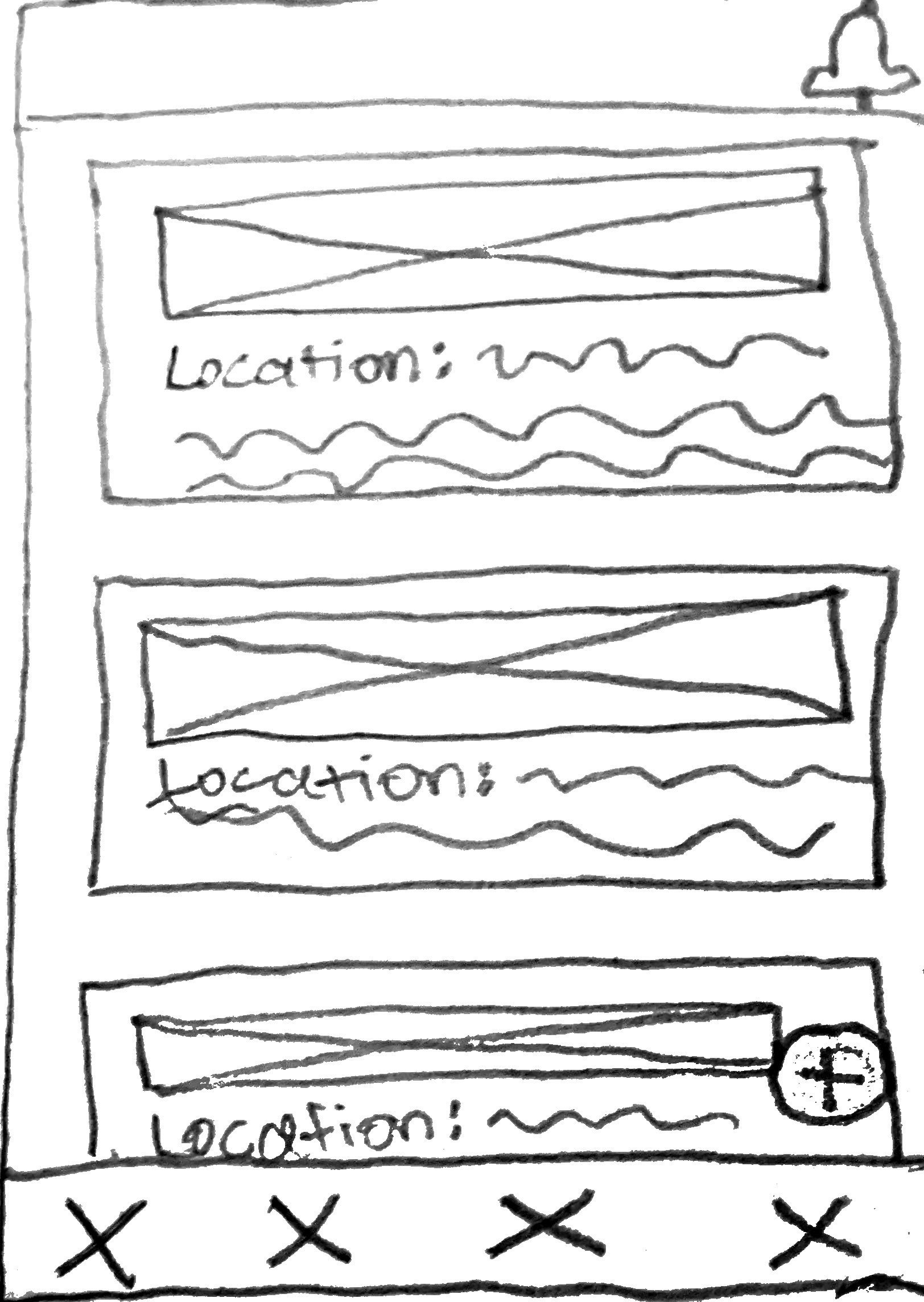
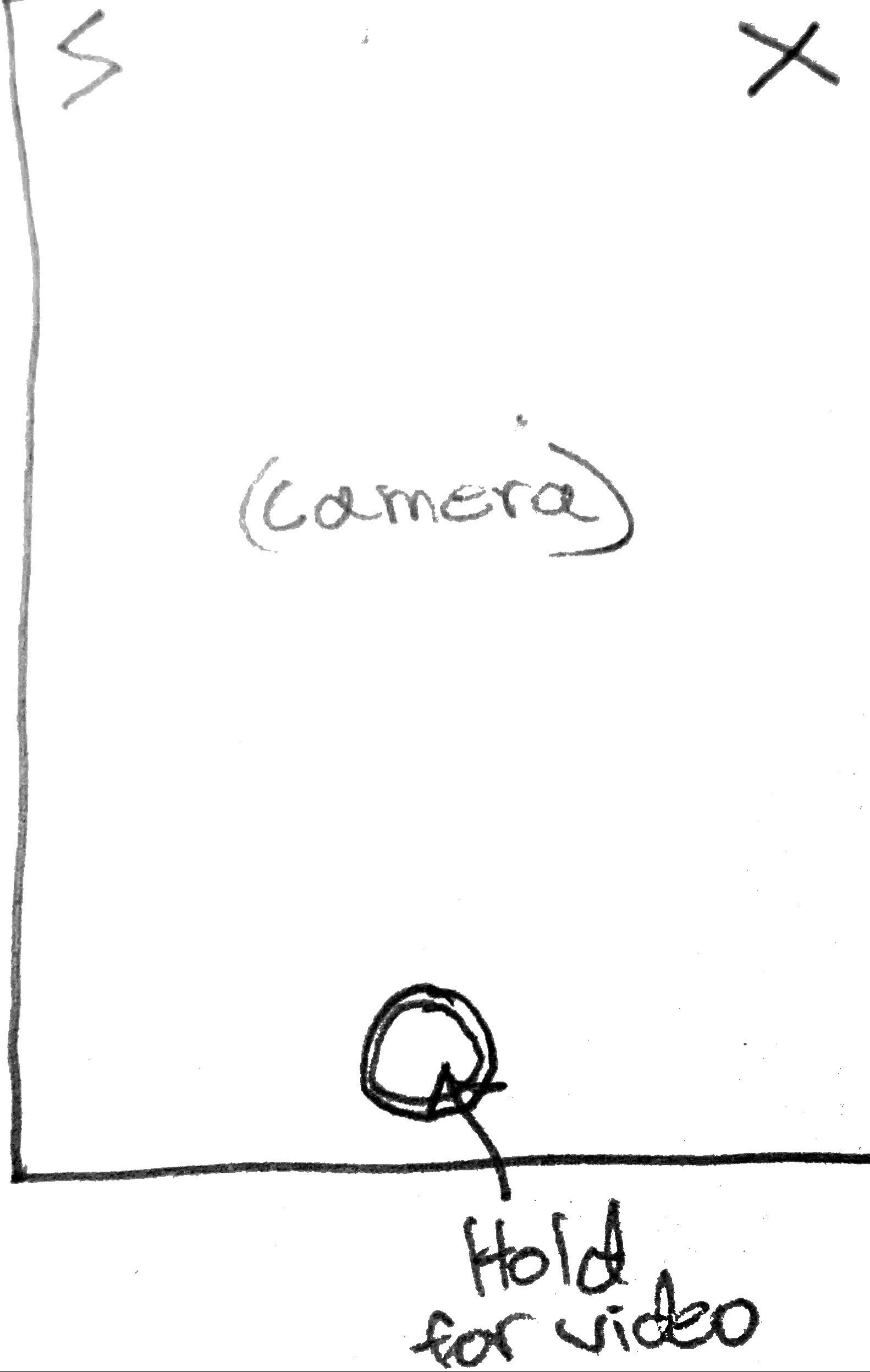
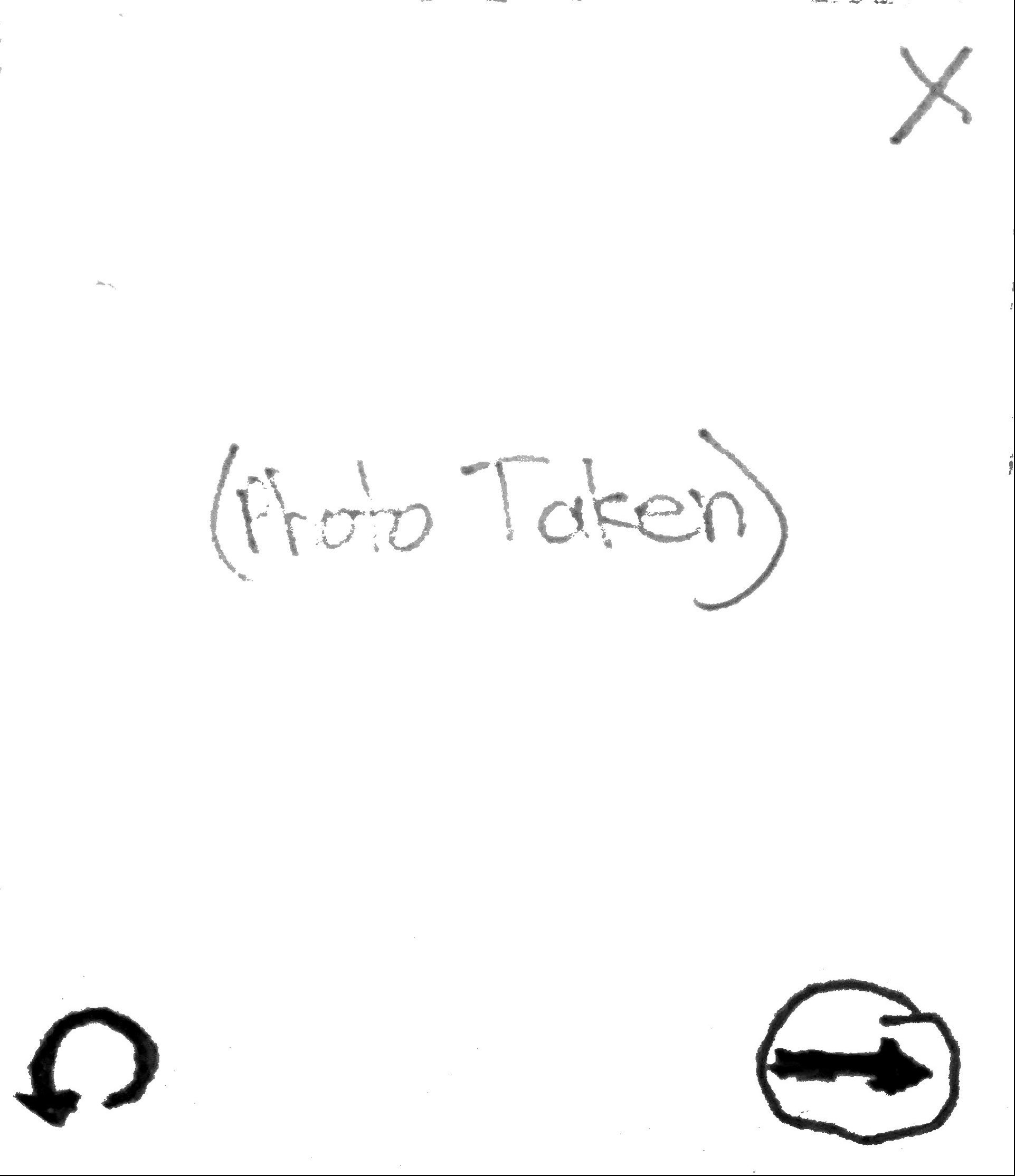
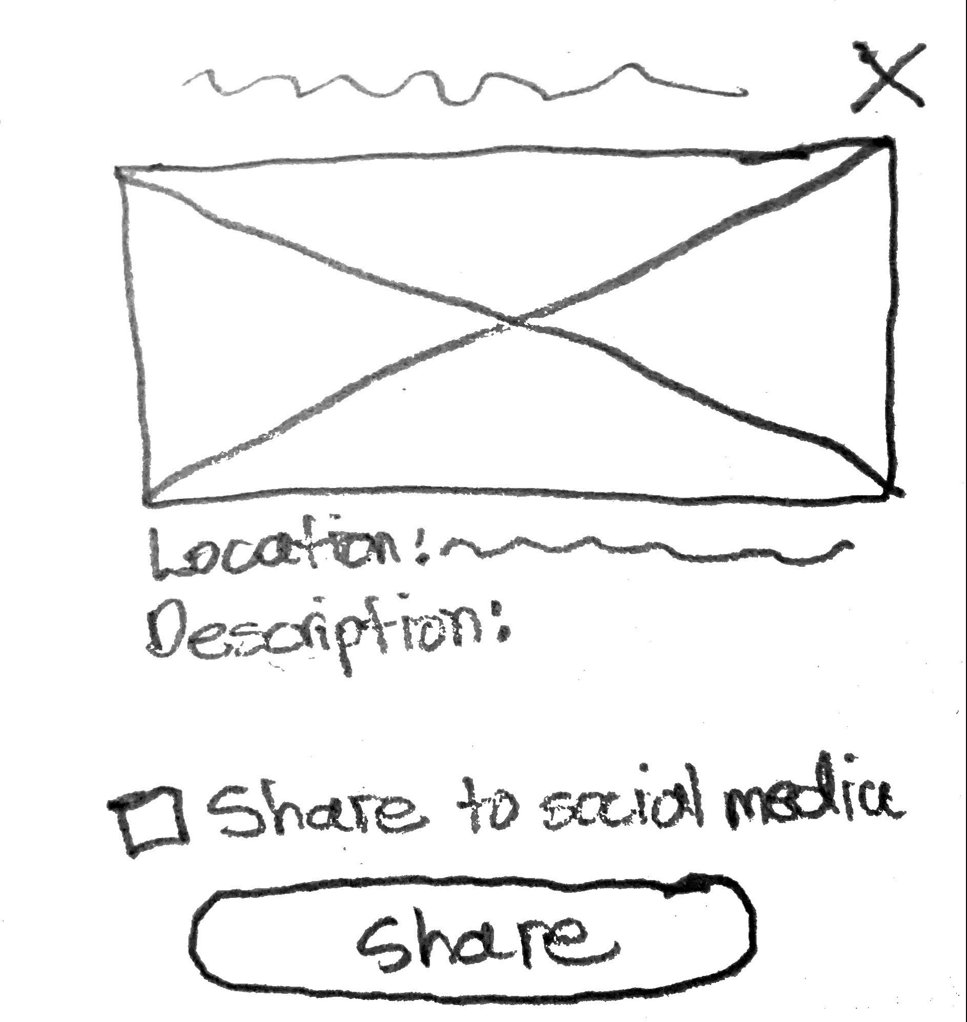
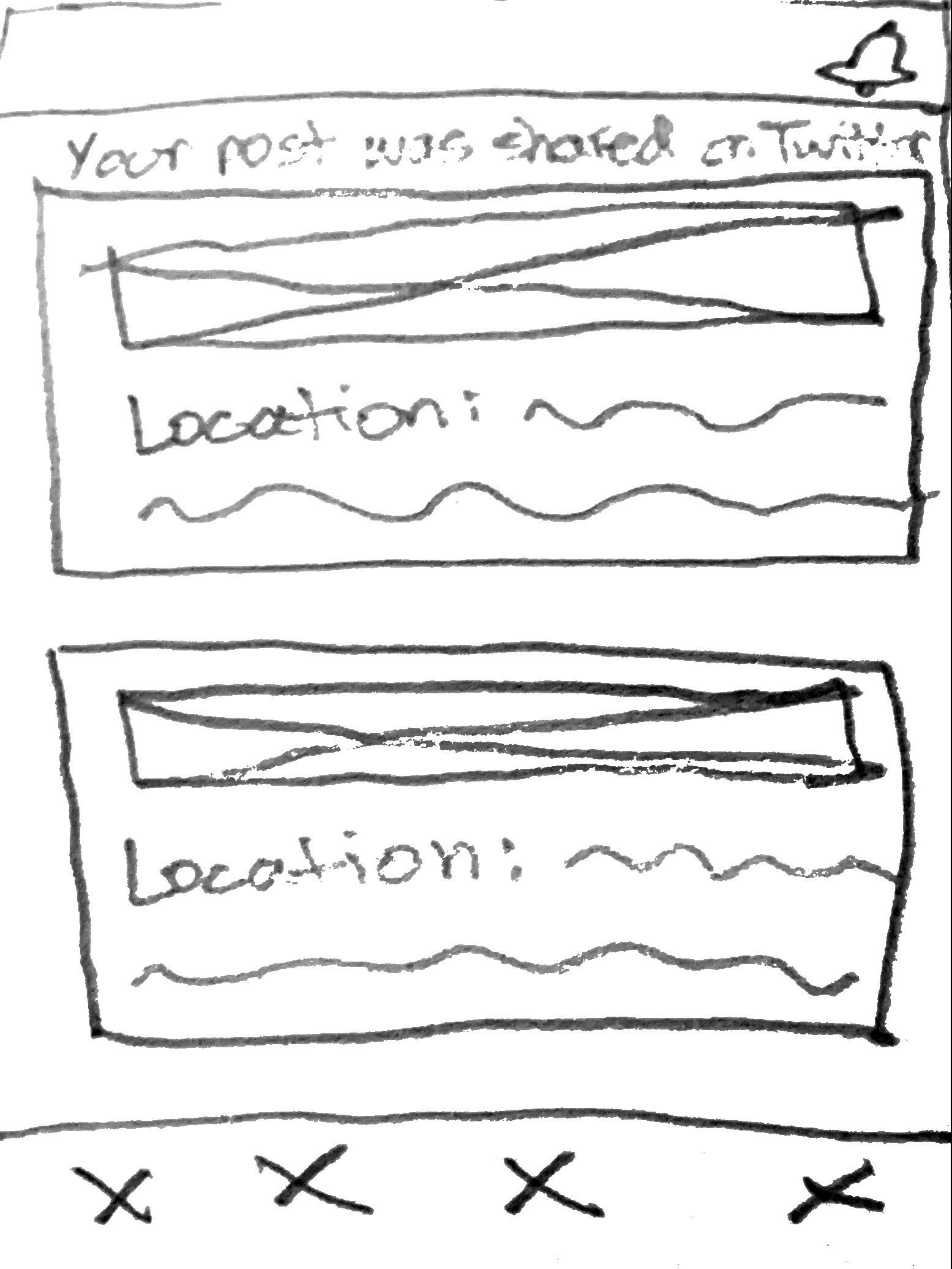
Using the user flow and the problem statement, I created low-fidelity wireframes of adding a post process. As I was thinking about these designs I prioritized making the process intuitive and efficient.

Delivery 🎁
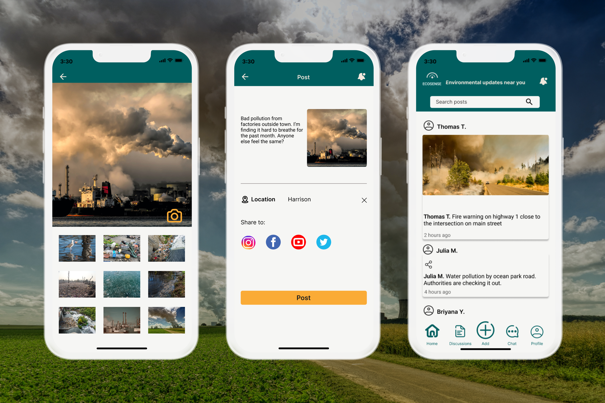

Stay Up-to-date in Your Community

Read the latest environmental news in your area to understand how you can be impacted by local climate disasters.
Share Your Concerns

Use photos, videos, and/or text to alert your community members and officials of any environmental changes you notice that affecting your way of life.
Reflection 🤔
Here is the top lesson that I learned throughout the process:
Choose a specific problem to address
For this hackathon, individual teams had to not only select which societal issue they wanted to focus on (the environment in this case), but also decide what specific area they wanted to create a solution for. Because of time constraints, I suggested designing a mobile app that could encourage users to communicate how they were affected by local environmental disasters to continue the much-needed conversation around climate change and increase the likelihood of officials being pressured to take action. Making the app easy to use (i.e. no prior knowledge needed to accomplish user goals) for a wide user demographic and also act as a short-term solution for drawing attention to sacrifice zones, made the design process smooth since we all understand who exactly the user who was and what the required features were.

Next Steps 📝
Test the prototype to see how intuitively users are able to share updates with each other.
Conduct user interviews to learn more about their pain points, concerns, and likelihood to regularly using Ecosense.

