DBSA SF
The Depression and Bipolar Support Alliance San Francisco chapter is a national organization that has a mission of improving the lives of people living with mood disorders. Through this organization, people can take advantage of online peer support, read information about depression and bipolar disorder, and have access to tools to better self-manage wellness. This project was conducted as part of the Girls in Tech SF Hackathon 2022 which DBSA SF participated in to gain insights into how to improve the user experience of their services. I worked on a team of six that included UX designers and a full-stack developer to create a high-fidelity prototype of a mobile native app.
My role:
UI Design
UX Design
Branding
Prototyping
Tools:
Figma
Flaticon
Miro
Google Fonts
Timeline:
One weekend
(up to 12 hours/day)


Discovery 🔍
The Problem
During their introductory presesntation, DBSA presented their problem statement:
“How might we remove the barrier of cost and access to care, and empower all individuals to self-manage their mental health?“
Defining Goals
User Goals
As a user, I want to learn more about mood disorders in a language that makes sense to me.
As a user, I want to speak with a professional in a confidential way.
As a user, I want to easily keep track of my mental health progress.
Potential Difficulties
The primary risk is that the services that DBSA provides will not be clear enough to the users, so they may turn to competitors or not find the mental health care that they need.
Another risk is that there will not be enough customizable options for users which could also affect how well they can improve their mental health.
Possible Solutions
Allow users to stay anonymous while having conversations with professionals.
Emphasize that DBSA services are cost-free to users.

Ideation 💡
User Flow
As a team we created a preliminary user flow chart to demonstrate how users will complete the two main tasks of speaking to a professional and tracking their mental health.

Design 💻
Wireframes
Using the user flow and the current DBSA website design, I created low-fidelity wireframes of the self-tracking wellness process. As I was thinking about these designs I prioritized making the process simple and including options for different types of input.
Using Figma, we created high-fidelity wireframes that were clearer and included better spacing measurements.
At this time I was focusing on the UI elements such as icons, photos, and buttons.
Scenario #1: Chatting with a Healthcare Professional
Scenario #2: Tracking Mood Trends
Branding
I created a mood board to gain an idea of the aesthetic and mood that we wanted to create in the native app. As I was searching for photos, I kept in mind that the primary user is a person who has a diagnosed mood disorder and is looking for a safe place to find treatment and discuss their wellness process.
The keywords I used throughout this task were: community, mental health, and support
Mood Board

Style Guide
The design elements are from the original DBSA SF website, however, I made some modifications by only using Arvo and Nunito as texts rather than the four used on the website. I also included the color orange so that there was more contrast against the cooler colors.
My goal was to create consistency within the app and a calming aesthetic for users.


Delivery 🎁
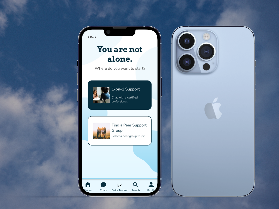

Maintain Anonymity
Avatars and pseudonyms will automatically be generated for users before they start their chat sessions with healthcare professionals. The names and photos can be changed at any time.
Keep Your Info Private

With an extra security passcode measure, users can rest assured that their self-managed mental health records will be safe.
Track All Factors in One Place
With a customizable daily tracker menu, users can input and reference all their mental health information in a single system.
Reflection 🤔
Here are the top lessons that I learned throughout the process:
Work closely with stakeholders
Throughout this hackathon, users had the opportunity to meet one-on-one with the DBSA SF presenters to clarify what the organization’s mission is and to understand what they wanted to gain from this event. These meetings proved very helpful because we were reminded what the ultimate goal was of the stakeholders and that gave us a good starting point for ideation.
Listen to everyone on the team
Working with multiple UX designers initially had some challenges especially with making final design decisions, but everyone on the team was receptive to the opinions and concerns of others which made the overall experience more collaborative and productive. By working as a team we were able to utilize our individual strengths and better manage the time that we were allotted to work on the project.

Next Steps 📝
Have a more in-depth discussion with the developer to better understand how the prototype will translate to a functioning mobile app.
Test the prototype to see how effectively users are able to get the mental health care that they seek.


