FABSCRAP
FABSCRAP is a non-profit organization that is working to end textile waste through recycling and reusing. People can send their unwanted fabrics to FABSCRAP to either be used in new products or repurposed as material for fashion designers/artists. This project was conducted as part of my CareerFoundry UX Design Program (“UI for UX Designers” specialization course). I redesigned this app to be more user-friendly for users who are interested in giving their old fabrics a second life.
My role:
UI Design
UX Design
Branding
Prototyping
Animating
Tools:
Figma
Adobe Photoshop
Adobe Illustrator
Lucidchart
Flaticon
Timeline:
2 months, part-time
(up to 20 hours/week)


Discovery 🔍
The Problem
Some people may be surprised to know that every 10 pounds of fabric saved from landfill has the same CO2-reducing benefit as planting a tree. With FABSCRAP, people can give their fabrics a second life by sending them to the organization where they can be reused by designers and artists looking to use sustainable materials at a reduced price or downcycled into a lower-quality product. However, the current process for signing up to recycle with FABSCRAP is confusing due to the unclear navigation, ambiguous eligibility requirements, and incomplete layout of the process. This system may deter some people from recycling their materials and therefore choose to simply throw them away out of convenience.
Users interested in recycling their fabric need a clearly laid-out process that is accessible to anyone looking to submit a pickup request. We will know this to be true when we see how many users successfully submit a pickup request without needing to contact the FABSCRAP support team for assistance.
Defining Goals
Project Requirements
In addition to the basic features that are required for web apps, I made a list of specific features needed for this redesign project.
A clear description of the requirements that potential recyclers must meet to recycle with FABSCRAP
A description of how the various fabrics will be handled by FABSCRAP
A request submission process that prevents people who don’t meet the eligibility criteria from submitting a request
A sign-up feature for people wanting to become recurring recyclers
A log-in feature for returning users
User Goals
To have a good understanding of why someone would want to use the FABSCRAP web app, I wrote three user stories. With these insights, I can have a list of the core features that need to be included in my redesign. This step was especially important to me personally because I am a climate activist and I want to get into the mindset of users who also want to help the planet by using certain tech products.
As a user, I want to get rid of my old clothes in a sustainable way.
As a user, I want to pass my leftover fabrics on to the next up-and-coming designer.
As a user, I want to request a pickup for my old fabrics quickly and efficiently.
Potential Difficulties
The primary risk is that the process for sending fabrics will be too complicated and the user(s) will decide not to utilize FABSCRAP’s sustainable services.
Also, users may not understand the difference between the recycle and reuse processes, and which one to select for their submitted fabrics. This can cause problems for FABSCRAP employees who need to sort through the mixed up fabrics.
Another difficulty could be ensuring that only New York City and Philadelphia residents use FABSCRAP’s recycle and reuse services since the organization is small and incapable of working with people nationwide.
Possible Solutions
Have the backend development ensure that only people with specific ZIP codes can submit pickup requests.
Clearly demonstrate how many steps a user must take to successfully submit a request.

Ideation 💡
User Flow
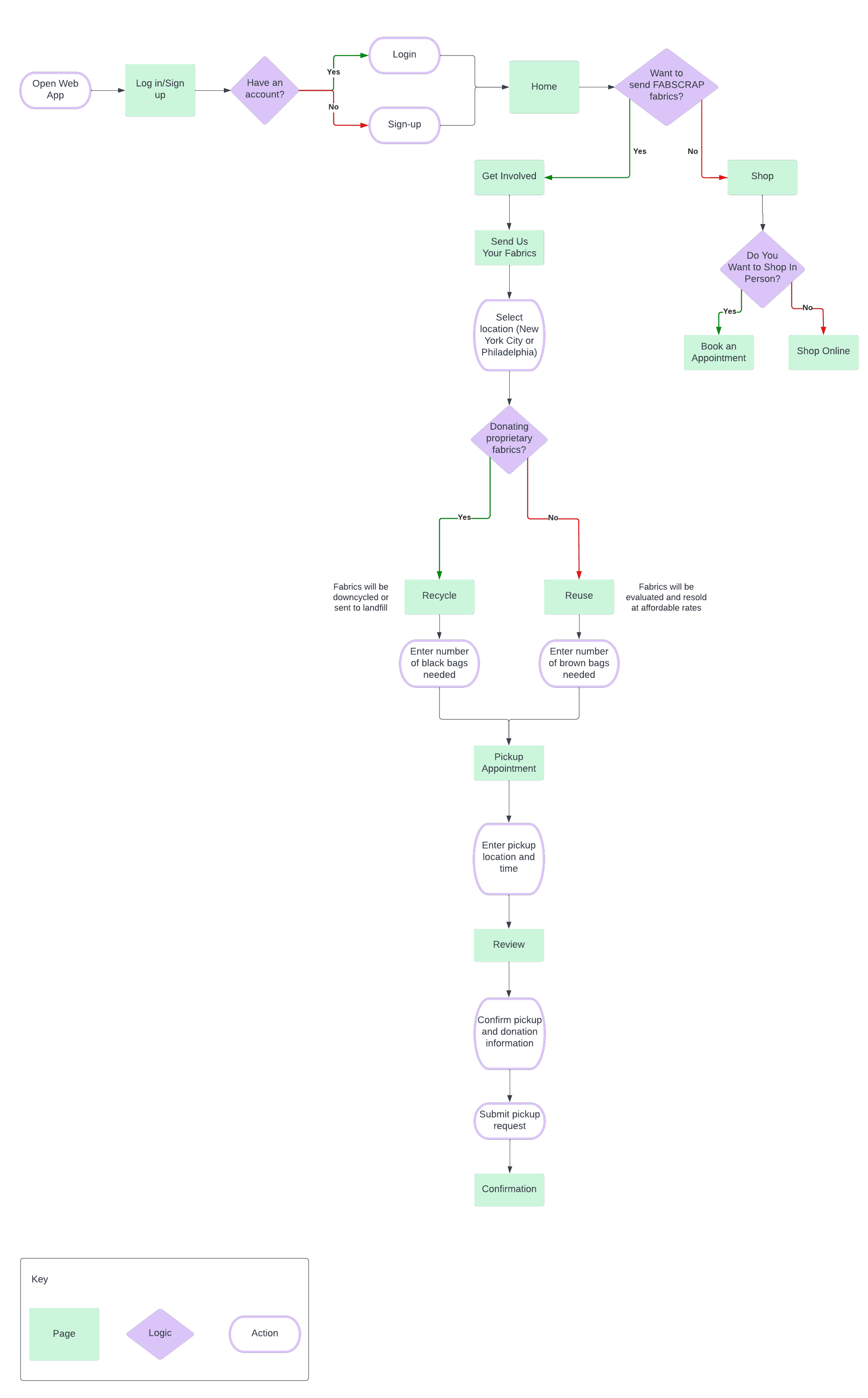
I created a user flow that shows how a user would achieve their main goal of sending fabrics to FABSCRAP for recycling/reusing. It also demonstrates how a user could shop for secondhand fabrics.
Design 💻
Wireframes
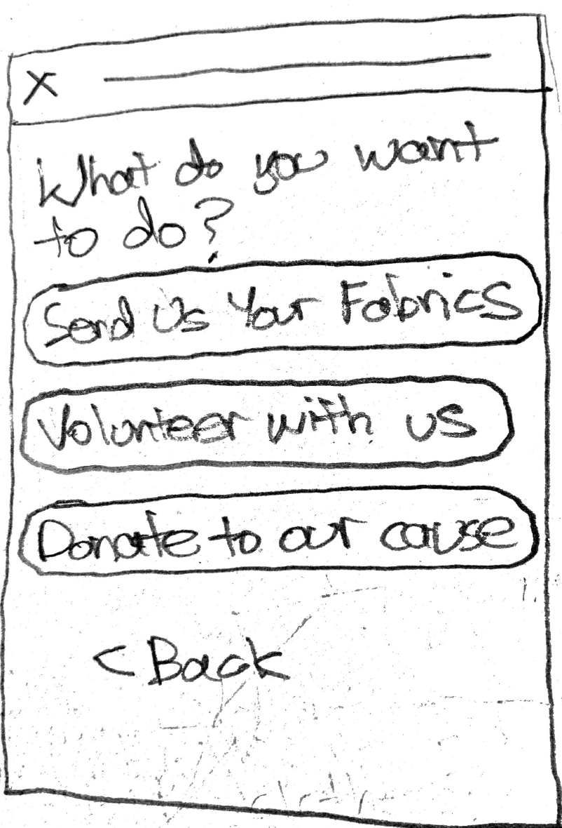
Using the user flow and the original design, I created low-fidelity wireframes of the recycling/reusing process, and checkout flow. As I was thinking about these designs I prioritized the objective of making the process of sending old fabrics more user-friendly.
Using Figma, I created high-fidelity wireframes that were clearer and included better spacing measurements.
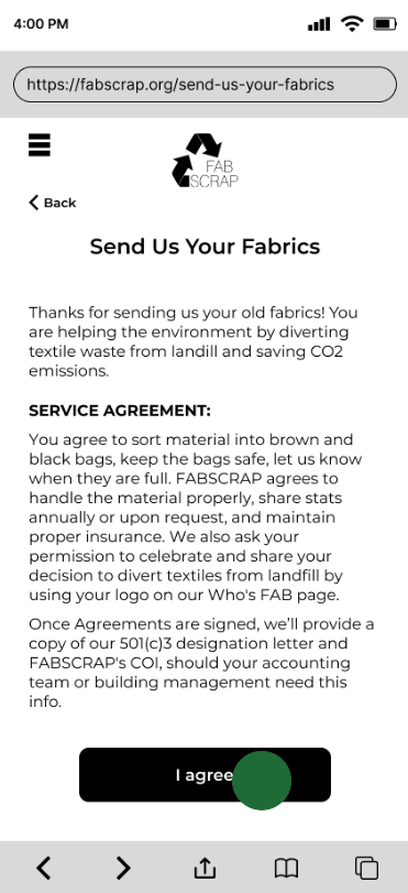
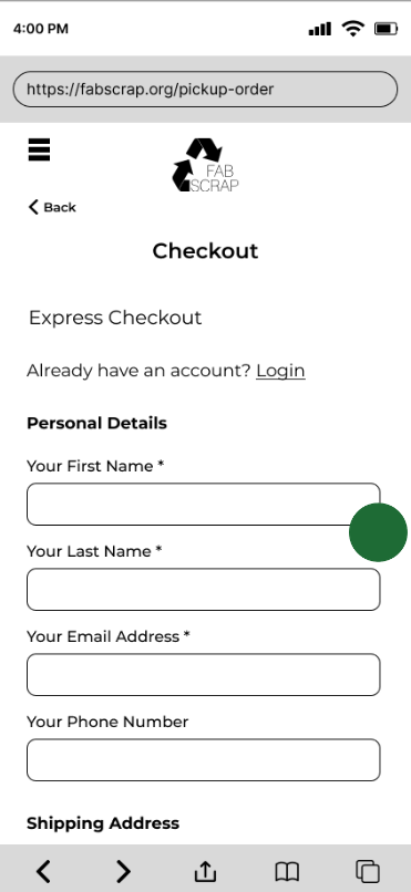
At this time I also connected the wireframes to show how the user will successfully complete their tasks.
Scenario #1: Submitting a Pickup Request to Recycle Fabrics
Scenario #2: Purchasing Fabric in Online Store
Branding
To gain an idea of what the images, color scheme, and overall aesthetic of the redesign should be, I created a mood board. As I was collecting photos I made sure to remember that the mood board should focus on the primary user, who is most likely a designer, and how they will benefit from utilizing FABSCRAP’s services.
The keywords I used throughout this task were: fashion, design, creativity, vintage, and individuality
Mood Board

Style Guide
Some of the design elements are from the original FABSCRAP design, specifically the logo, the gold hue, and the “how our process works” graphic (displayed in the desktop and tablet mockups). However, I made some changes in how these elements were used so that the text is more legible and the colors complement the surrounding layout.
My goal was to use text fonts and colors that make users feel excited to collaborate with an innovative organization and empowered to support a meaningful cause.


Delivery 🎁
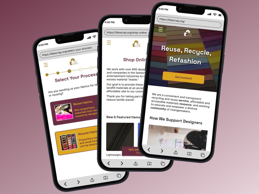

FABSCRAP 2.0
As I redesigned various pages of the FABSCRAP web app, I emphasized visual hierarchy, clear language, and user autonomy.
Make Mission Clear
Before


In the original design, the first section of the homepage attempts to convey why FABSCRAP was founded and the work of the organization.
However, the mission is lost since the jargon is unclear and the text does not stand out against a colorful, light background.
After


At the suggestion of my mentor, I created a slogan so that users would instantly gain an understanding of what FABSCRAP does.
The slogan is a play on words with “refashion” relating to both the organization’s sustainability goals and the fabrics that are sent in by the public.
Re-organize User Flow
Before


The menu items aim to provide various options that the user can select from, however, it can be hard to intuitively know what the differences are between the options.
For example, does “donate” refer to fabrics or money? Also, the menu only features “recycle” but is that the same as “reuse” which is mentioned elsewhere on the website?
After


By having fewer options on the redesigned menu, the user does not feel as overwhelmed by the different ways that they can interact with the website.
Additionally, by moving the primary actions of FABSCRAP users under the umbrella of “Get Involved,” users can gain additional context for each action on another page.
Utilize Visual Hierarchy
Before


The options for supporting FABSCRAP are featured in the middle of the homepage – not ideal, especially for new users who do not know the website’s layout.
After


Here the three main ways for users to work with the organization are displayed at the top of the new “Get Involved” page. This placement ensures that users will see these options as soon as they are directed to the page.
Additionally, the primary purpose for users to utilize FABSCRAP’s services is displayed first in an eye-catching color for emphasis.
Adjusting for Different Breakpoints
For tablets and desktops I made sure that the overall design aesthetic stayed the same while simultaneously taking advantage of the additional screen space.
Landing page


Recycling/Reusing


Reflection 🤔
Here are the top lessons that I learned throughout the process:
Think of visually impaired users
During the Design phase, I knew that some conditions like color blindness are very common and affect how users experience tech products. For this reason, I tested the contrast between various hues that I was considering for the design, and then I chose colors that had the highest contrasts for the palette.
Prioritize important actions
Following the principle of visual hierarchy, I designed each page to have the primary action (e.g. requesting pickup for old fabrics, submitting an online order, etc.) be toward the top and easily identifiable to the user.

Next Steps 📝
Testing the redesign with volunteers to see if it is easier for them to complete tasks than it is on the original design.
Collaborating with the FABSCRAP team to discuss potential business requirements that would affect the redesign.


