Mentor Buddies
Mentor Buddies is a mobile native app that allows users to connect with mentors in tech in exchange for charity donations. This was a short-term project conducted as part of the Bitesize UX course “UX Design for Business Goals” led by a senior UX designer. For this redesign project, I worked on a team of designers and used stakeholder interviews, user research, analytics, and key metrics to improve the onboarding process for Mentor Buddies. I specifically focused on one page, the mentor’s profile, which is what I will cover in this case study.
My role:
UX Design
UX Research
UI Design
Wireframing
Tools:
Figma
FigJam
Zoom
Timeline:
5 hours

Discovery 🔍
The Problem
Mentor Buddies, designed by the founder of Design Buddies, was created to connect experts in the technology industry with newbies who are looking for mentorship. After a privately held beta test, Mentor Buddies discovered that out of all users who initially signed up on the app, only 1.9% initiated a chat session with their mentor. The team then started looking for a way to improve their onboarding process to increase the number of users who connected with their mentors.
First, the senior UX designer had a stakeholder interview to understand the business goals and concerns of Mentor Buddies.
Learning from Stakeholders
We conducted a stakeholder interview with the Mentor Buddies founder to learn more about business goals, current challenges, and constraints. Here are the insights I gained during the stakeholder interview:
Success Looks Like
What is their desired outcome?
New users have their first session with their mentor. The number of mentors and mentees increases. The onboarding experience allows users to easily and confidently be matched with mentors.
Current Solutions and Challenges
What's wrong with how it works now?
There are a lot of users that never have their first session with a mentor. The reason for this dropoff point is largely unknown.
Recent Achievements
What is currently going well with the process?
The users who do interact with their mentors have given great feedback on their interactions. After that first session, users often return for more mentorship sessions.
Constraints / Requirements
What are some things we'll have to "work around"? or consider?
Users must sign up for an account, verify their phone number, and then make a donation before starting a chat session.
Understanding the User
Looking at the Numbers
Next, I looked at the analytics from the beta release to identify a possible point of friction in the onboarding process.
Key Insights from Analytics:
There is a significant percentage of users who do not proceed after viewing the mentor’s profile: 81%
Assessing User Feedback
Additionally, Mentor Buddies sent us some user feedback from their beta release. I looked over some of the comments that related to their opinions of the profile screen. Names were changed to protect the identities of the mentees and mentors.
With these insights, I was given a starting point for how to redesign the profile page.
“Would love some reviews from other mentees...not on the mentor’s UX skills but more so their experience chatting with them.”
“I wish I knew a little more about the mentor outside of their work experience.”
“I’m sure this mentor is great, but I don’t really feel sold that they (or anyone) is a great match for what I’m looking to learn.”
Defining Goals
User Goals
As a user, I want to easily and confidently match with a mentor who can help me achieve my career goals.
Business Goals
As a business owner, I want new users to meet with their mentors to accomplish the original mission of Mentor Buddies.
Potential Difficulties
The primary risk is that the user will still not have their first interaction with their matched mentor and the process will stall.
Possible Solutions
Make it easier for the user to view their mentor’s qualifications specifically regarding mentorship.
Include a way for the user to see why they matched with the specific mentor.

Ideation 💡
Themes
To gain a better understanding of our user’s journey, I identified themes of each stage of the onboarding process.
The theme for the profile page was connection because overall feedback showed that users wanted to know their mentor was the right person to talk to.
Design 💻
Wireframes
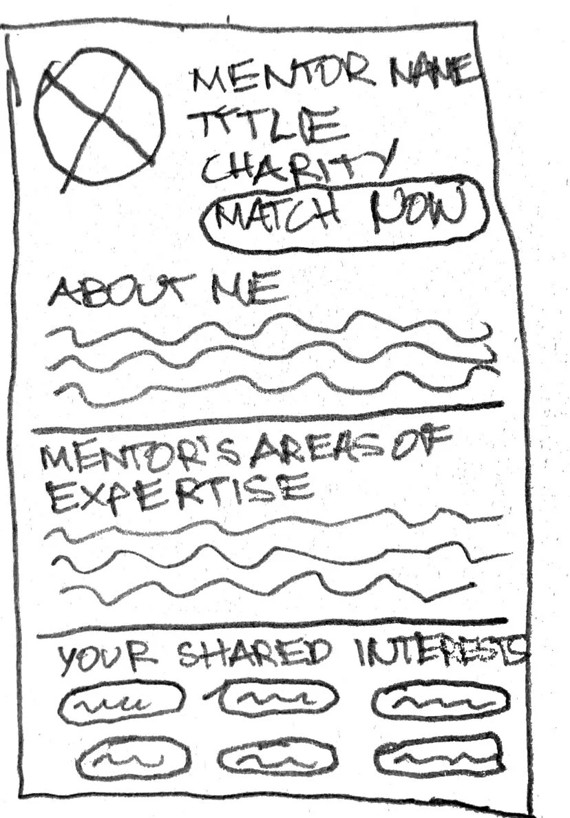
I created a low-fidelity wireframe of the Mentor Buddies profile page.


Delivery 🎁
Mentor Buddies 2.0
Getting to Know You
Before


The biography of the original design is too simple and does not go into detail about who the mentor is and why they are excited to meet new users.
After


To address the feedback of users wanting to know more about their mentor, we designed features that allow users to learn about the mentor’s personality, style, and experience from previous mentees.
Reflection 🤔
Here is the top lesson that I learned throughout the process:
Analytics Aren’t Everything
While reviewing the beta release analytics from Mentor Buddies, the senior UX designer emphasized that these analytics could help designers learn where to focus attention, but the numbers would not explain “why” users felt a certain way. With this tip in mind, I made sure to remember that more research (including surveys, interviews, and testing) would be necessary to understand the user’s pain points and ultimately design an app that meets the business and user goals.

Next Steps 📝
Make a complete and coherent high-fidelity prototype for the whole onboarding process.
Have another meeting with the stakeholders to discuss the redesign and receive any feedback from Mentor Buddies.
Test the high-fidelity prototype with the users.
