SeniorTix
SeniorTix is a website that aggregates senior citizen discounts on events, outings, and activities. This was a short-term project conducted as part of a Bitesize UX design sprint. Under the instruction of a senior UX designer who had already conducted the first usability testing session, I analyzed the feedback and redesigned the website to include an accessibility design. Accessible design is a design process in which the needs of people with disabilities or impairments are specifically considered.
My role:
UI Design
UX Research
Wireframing
Tools:
Figma
Timeline:
One hour

Discovery 🔍
The Problem
For this project I asked myself the following question:
How might I better support senior citizens as they find discounts for activities in their area?
Defining Goals
User Goals
As a user, I want to view and take advantage of deals on activities in my area.
Potential Difficulties
The primary risk is that the website will not be easily accessible to viewers and they will abandon it before accomplishing their goal.
Possible Solutions
Change the color palette to increase the contrast between the elements of the webpage and the background color.
Edit the font style so that the text is more legible against the background.

Ideation 💡
Card Redesign
While watching a recording of a user who was visually impaired navigate SeniorTix, I identified a few accessibility issues with the card components.
The low contrast between the background colors/images and the text makes the overall copy difficult to read.
The small font size and font style make the cards difficult to read for the user.
With these insights in mind, I started to ideate the redesign of key features of the website.
Design 💻
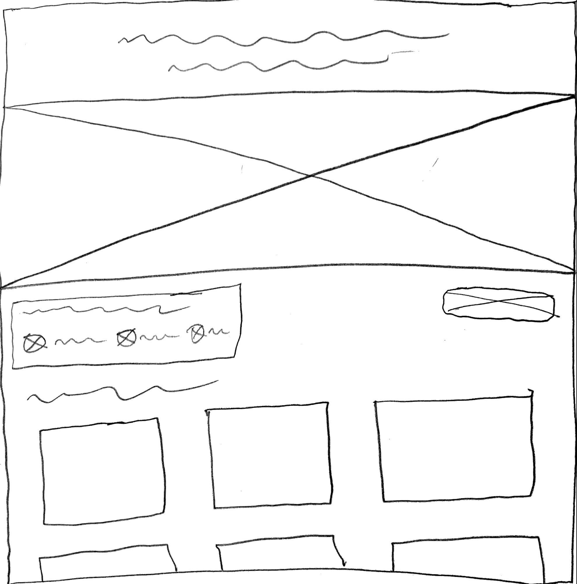
Wireframes
Using the usability test insights, I created a low-fidelity wireframe of the webpage. As I was wireframing I was thinking of how the users could clearly view the copy and the images.

Delivery 🎁


SeniorTix 2.0
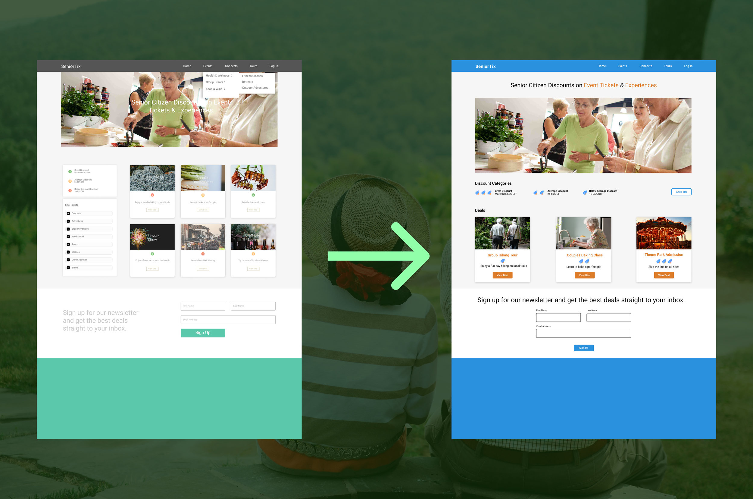
Here is the overall redesign that I created for SeniorTix.
Before

After

The Breakdown
Make the Features Pop
Before

The color palette is very monochromatic which makes sense for some text, but it makes it difficult to read the light grey copy that is against a white background and colorful images.
After

By adding brighter colors and incorporating them into the features like buttons, icons, and headings, I made it easier for the user to better read the copy and focus their attention to specific parts of the screen.
Rearrange the Key Information
Before


The name of the activity is completely lost on top of the image. Not only does the white text blend into the light grey background, but it is also too thin of a font style to be easily read.
After


I moved the name of the activity to underneath the image so that it does not obstruct the image and is more legible against the white background.
Use Accessibility Standards
Before


The original design uses a very small font size and requires the ability to distinguish colors to read the different cards. This is an issue for users who are visually impaired.
After


Using WCAG 2.0 A/AA standards and Google Material Guidelines, I made the overall UI more professionally accessible.
Reflection 🤔
Here is the main lesson that I learned throughout the project:
Remember the needs of users
While it’s common practice for designers to keep the needs of the primary persona in mind while designing the user experience, it is especially necessary to remember that users who belong to a specific demographic (e.g. senior citizens) will have an extra set of needs that may not always be required for other projects. In this case, the average user is extremely likely to have accessibility needs that require the designer(s) to address specific pain points to make SeniorTix a user-friendly website.

Next Steps 📝
Re-test the website to see if the redesign addresses the pain points from the previous usability testing session.

