CityPups
CityPups is a mobile app that helps people living in cities find the perfect dog to adopt. This was a short-term project conducted as part of a Bitesize UX design sprint. Under the instruction of a senior UX designer who had already conducted the first usability testing session, I analyzed the feedback and redesigned the onboarding process (a questionnaire) of this app so to better address the user needs.
My role:
UI Design
UX Research
UX Design
Wireframing
Prototyping
Tools:
Figma
Timeline:
Two hours


Discovery 🔍
The Problem
People living in cities have a lot to consider when adopting a dog. Limited space, size, and other lifestyle factors create a unique set of needs to make sure that both owners and pups are set up for a happy and healthy life together. CityPups ensures that want-to-be owners can find a canine pet that fits their lifestyle by answering a series of questions and then receiving a list of potential matches. However, the current onboarding questionnaire to match users with a dog through CityPups is lacking due to vague questions, limited response options, and doubts about the accuracy of the results. This process may deter some people from adopting a dog since they may wonder if their city lifestyle will be suitable for any type of dog.
Users interested in adopting a dog need an onboarding process that is thorough and easy to understand. We will know this to be true when we see how many users are satisfied with their match options and complete the adoption process.
Defining Goals
User Goals
As a user, I want to provide accurate details about myself to be matched with a dog that is compatible with my lifestyle in the city.
Potential Difficulties
The primary risk is that the onboarding questionnaire will not be comprehensive and customizable enough for users who are looking for dogs that meet their specific needs.
Possible Solutions
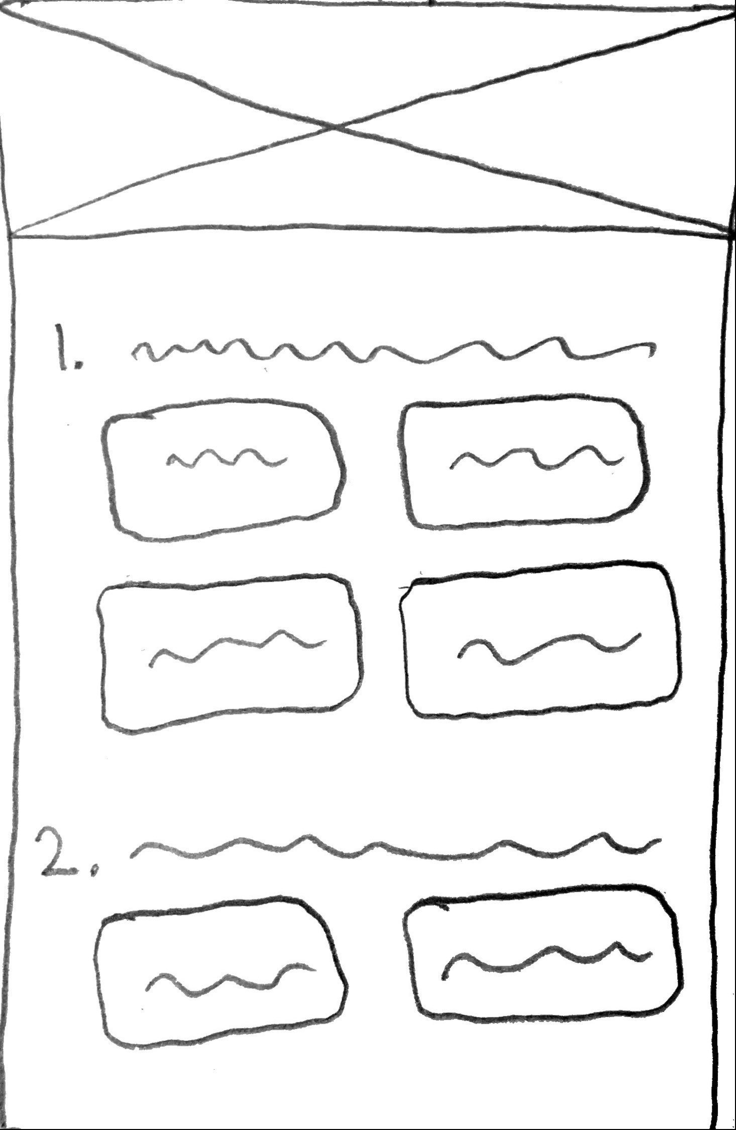
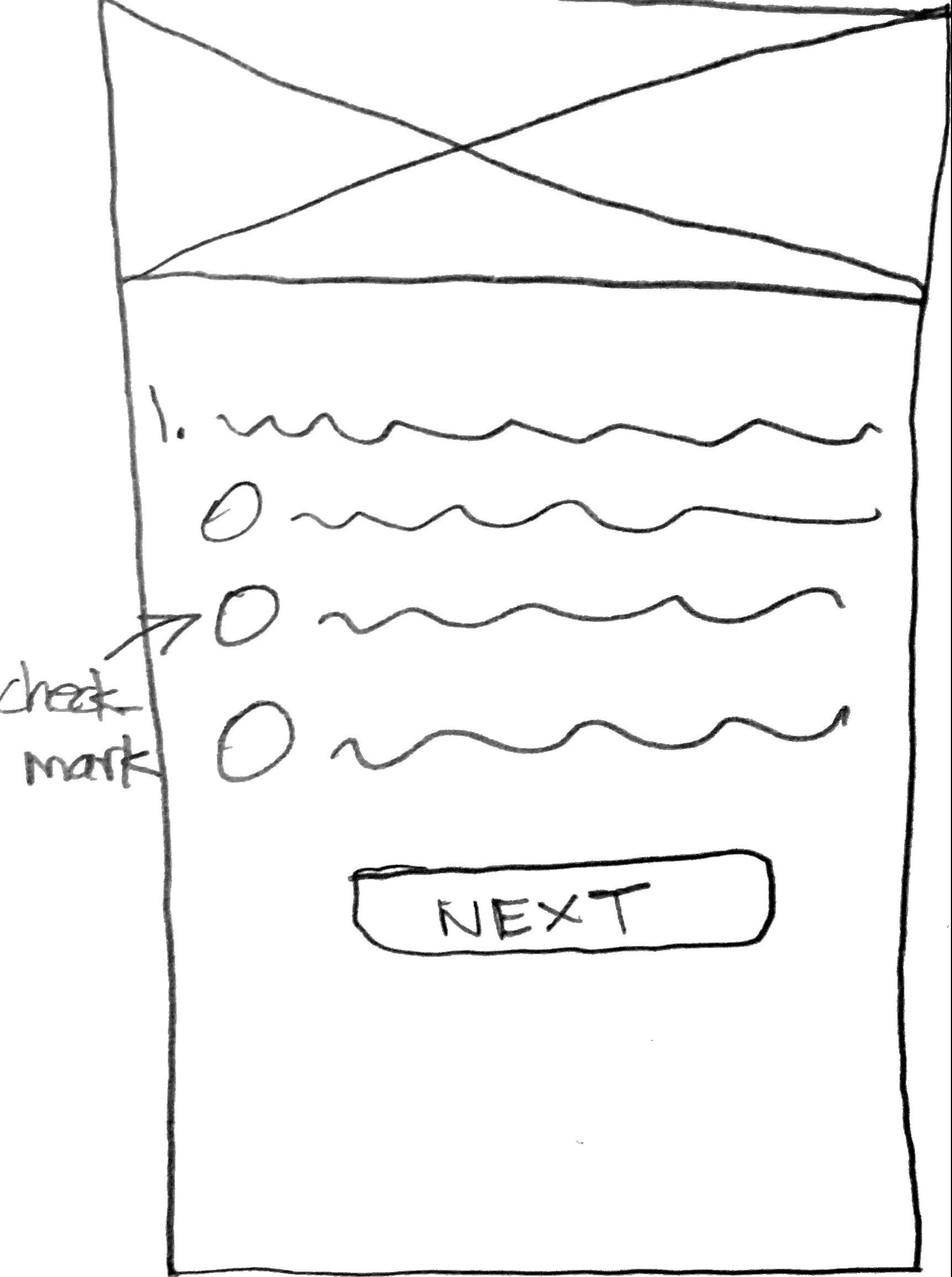
Allow users to select multiple options so they have a wider selection of options.
Include strong microcopy so that users fully understand the questions and can answer to the best of their abilities.

Ideation 💡
User Flow
Although it was not one of the senior UX designer’s provided deliverables, a simple user flow helped me visualize how the user would be matched with dog options.

Design 💻
Wireframes
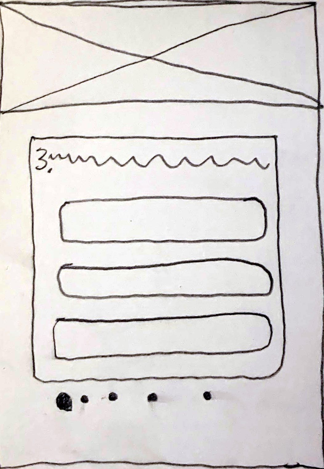
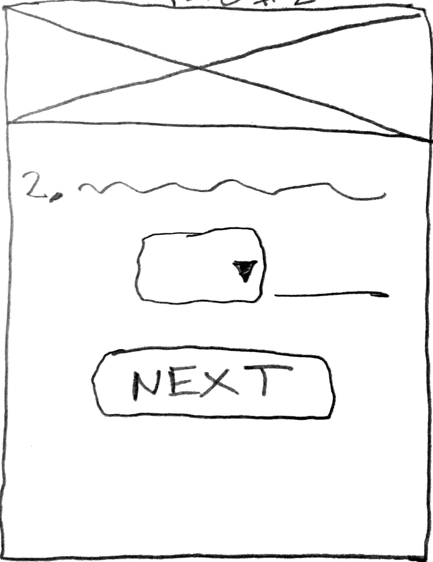
Using the flow chart and usability test insights, I created low-fidelity wireframes of the onboarding process. As I was wireframing I was thinking of how the users could select more than one option to increase the chances of having more compatible matches.
Version 1
Version 2

Delivery 🎁
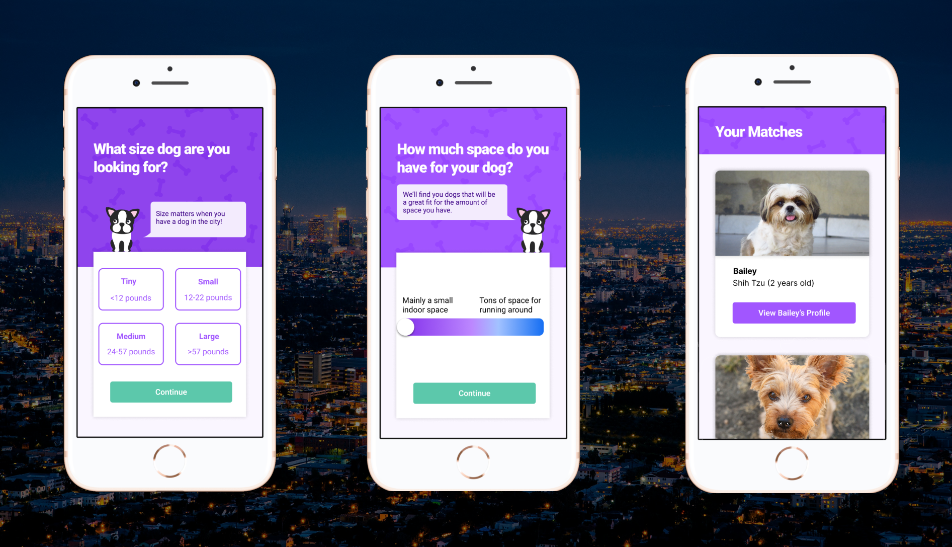

Get Clarification

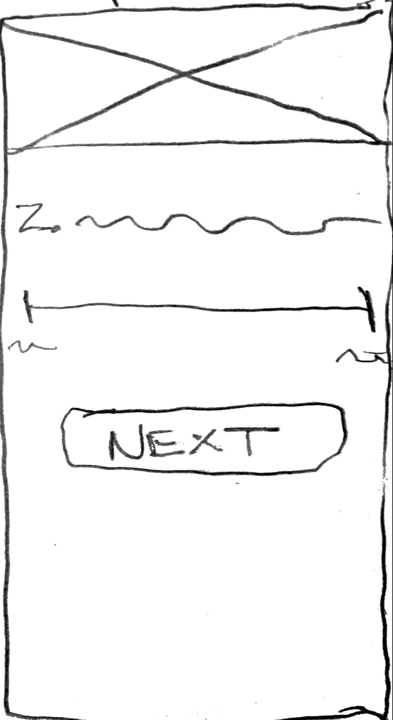
Measurements will be used to define CityPup’s classification of dog sizes such as “tiny” and “large.” This feature will help users better understand the size of the dog that they are able to accommodate.
Provide a Better Range

With more detailed descriptions on either end of the spectrum, users can more accurately estimate where they fall on the spectrum for space.
Reflection 🤔
Here is the main lesson that I learned throughout the project:
Consider a range of user scenarios
In the usability testing sessions, the tester noted that for some of the questions, none of the available responses fit their lifestyle situation. For example, for the question that asks about how much space is available, the tester themself did not have a lot of space in their small city apartment, but the building they lived in had a large outside community space. This feedback was very helpful because it made me rethink the needs that different users may have and how not all of their circumstances can fit into a single response option.

Next Steps 📝
Re-test the prototype to see if the iterations address the pain points from the previous usability testing session.

